
Antara Case Study
Building a drinks brand that has to earn its place on a shelf
From wordmark and packaging through to legal compliance, the Webflow site and the launch behind it. A brand built end to end, then supported as it goes to market.

Most of the work we do lives on a screen. Antara had to exist as an object first.
A hard seltzer is bought in about two seconds, standing in front of a fridge, next to eight other cans making broadly the same promise. Everything the brand needs to say has to survive that. So the brand was designed from the can outwards: the mark, the colour, the copy and the legal furniture all resolved against a 250ml surface before a single web page was drawn.
We designed the brand and packaging, then designed and built the website, and now support the commerce and digital side as the product goes on sale.
What is Antara
Antara is an agave hard seltzer made in London. A light blend of agave spirit, sparkling water and real fruit, at 6.0% ABV and 130 calories per can. Little sips, big memories.
The launch range is two 250ml SKUs:
Apple and Elderflower
Rhubarb and Hibiscus
It is a women owned business selling into a health-focused young adult audience, in a category that is crowded and getting more so. The brand device that holds it together is an ant. Small package, big impact.
Brand Direction
There was a product, a founder, a name and an ant. No mark, no packaging, no print-ready artwork, no site and no way to sell. We started with a kickoff call, then an onboarding questionnaire, because written answers force a founder to be specific in a way a conversation does not. Three answers shaped everything after: the brand could not belong to agave, because the plan already ran past it to vodka and non-alcoholic versions; it had to feel premium, British and timeless in a category that is mostly the opposite; and the audience was 22 to 35, urban, fitness-aware, the Hyrox and padel crowd who still drink in good pubs.
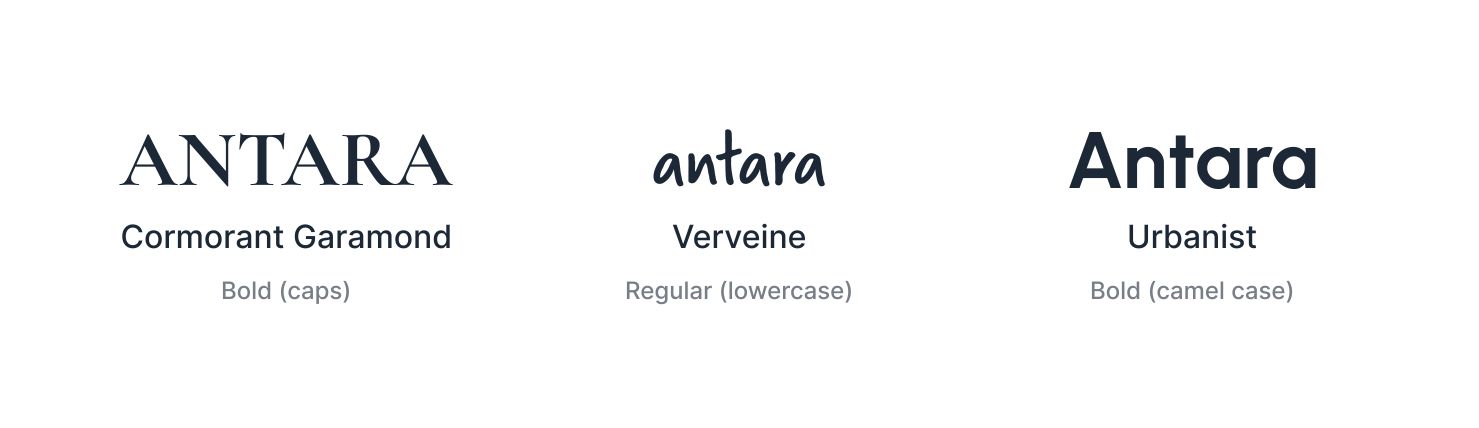
Three typefaces, three jobs. Type does more of the identity's work here than it does on most drinks brands, because it is one of the few things that stays fixed while colour moves with the flavour. Cormorant Garamond carries the headings and the wordmark, a high-contrast serif with fine hairlines, and it is where premium and timeless come from. Verveine handles subheadings and the ingredient lines, the loose hand-drawn voice in the system, and it keeps a very simple layout from feeling corporate. Urbanist does everything else, a clean geometric sans for the category line, flavour names, legal copy and the site, chosen because it stays readable at 6pt on the back of a can and still holds up at display size on the web. Something formal, something human and something that gets out of the way.
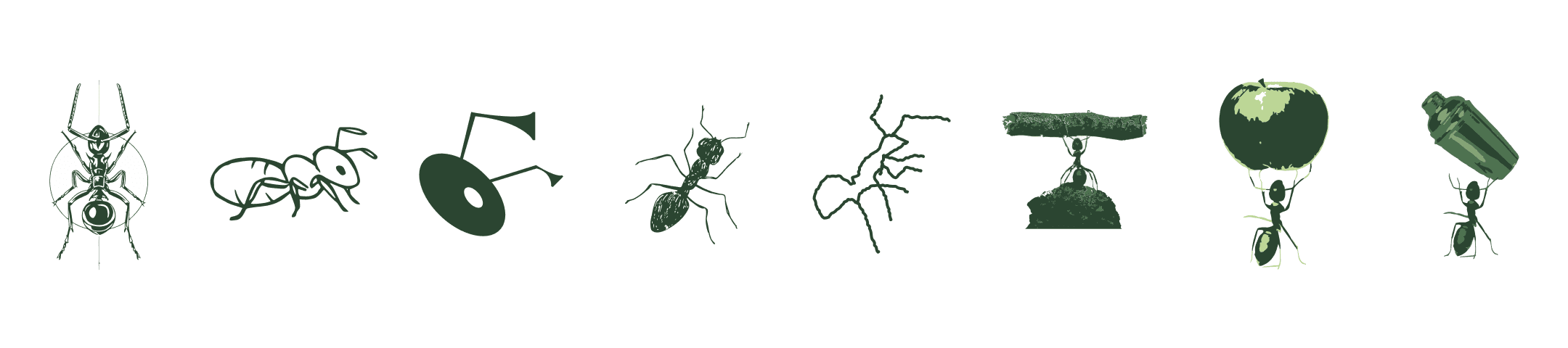
The ant was a given. What it looked like was not. The first routes were about drawing an ant well. A symmetrical specimen study, then a single-line version inspired by fine-line tattoo work, too detailed to survive being printed small and wrapped around a can. An abstracted geometric mark went the other way and stopped reading as an ant at all. Then rougher hand-drawn sketches, deliberately raw and anti-AI, closer to the marks coming out of streetwear and technical outdoor brands, with far more character but still only ever saying "ant".
The turn came from the idea underneath the brand rather than the animal on top of it. An ant carries many times its own weight, the same argument a 250ml can makes against a pint, so the ant was given something to lift: first a log, then an apple, then the cocktail shaker it holds now. The shaker landed because it ties the strength idea back to the product instead of a single ingredient, the same reason the identity never belonged to agave.
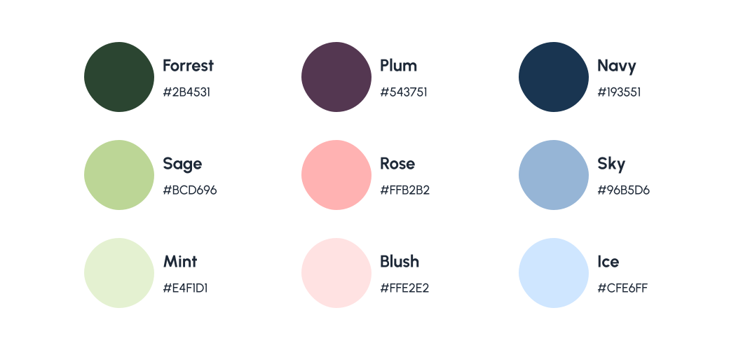
Colour belongs to the flavour, not the brand. Most drinks brands lock to a single colour and treat flavours as variants of it. Antara does the opposite. Each flavour gets its own two tones, and what stays constant is the type, the ant and the pattern. That pattern is a hand-drawn organic swirl, closer to a topographic map than anything fruit-led, drawn once and recoloured per flavour, so the range reads as one system while every can looks different. The reasoning was structural. A single brand colour makes every new flavour a negotiation with the existing palette and makes the eventual move beyond agave harder. Letting flavours own the colour means a third flavour is a colour and a name rather than a redesign.
Designing the Can


Three routes, none meant to win outright. The directions were presented as cans rather than boards, because a seltzer brand only becomes a brand once it is wrapped around 250ml and sitting in a fridge. The first was pattern-led, an all-over swirl in the flavour colour behind a clean white label. The second was image-led, a photographic ingredient scene under a large centred wordmark. The third went literal, with cut fruit and botanicals sitting straight on the flavour colour.
The useful part is watching which pieces a founder keeps from each. Route one gave the pattern and the container system. Route two gave the ant. Route three gave almost nothing: photographed fruit on flat colour reads as a soft drink, which is the one thing an alcohol brand cannot afford.


The final can took the pattern and gave it a limit. Route one's swirl was the right device at the wrong scale, so it was pulled back to the top and bottom of the can, with everything that has to be read sitting in a calm off-white band across the middle. That split is what lets the design be loud at three metres and quiet at arm's length, and it means the pattern can change with every flavour without the layout ever moving. The ant sits in a badge above the wordmark, closer to route two than to anything else tested, with Cormorant Garamond for the wordmark, Urbanist for the category line and flavour and Verveine for the ingredients, so a very simple layout still has texture in it. The tagline moved to the shoulder above the band, seen when the can is picked up rather than competing with the wordmark. Both SKUs share the same structure, type and layout, and the colour is what tells them apart at a glance.

The back had to do the admin without looking like it. A can is not a front and a back, it is a wrap that a person turns in their hand. The obvious move on a 250ml can is to split the back into two columns so everything fits. We laid it out as a single panel instead, so turning the can feels like reading one object rather than crossing from the marketing side to the admin side. The legal payload was designed in rather than fitted around, because getting it wrong means a print run you cannot sell. Units, the pregnancy icon, the Chief Medical Officers' guidance, Drinkaware, origin, recycling marks, volume, ABV and the barcode were all confirmed up front and treated as fixed furniture. Best before and batch codes print on the base rather than the artwork, which keeps the panel clean and means the label does not change between production runs.
The Website

The site is built in Webflow, chosen for where Antara is heading rather than where it is now. The brand will want product pages, a stockist map, event pages and content, and building on Webflow from the start avoids a rebuild the moment the range goes on sale.
The landing page is designed and live, carrying the brand, the product and an email signup that runs into Brevo through Zapier. It is kept to a single field, because every extra field on a pre-launch form costs signups it does not earn back, and it means the list is building ahead of launch.
Ecommerce is being worked on now. Webflow keeps the brand and marketing side either way, and the store platform is being chosen on payment coverage, fulfilment and running cost at launch volumes rather than defaulted into.
Results

Full brand identity from a name and an ant: typeface system, logo and a flavour-led colour and pattern system built so new flavours and the eventual move beyond agave need no redesign
Both 250ml SKUs designed as print-ready artwork, with all mandatory UK alcohol labelling built in from the start rather than fitted around the creative
Webflow landing page designed, built and live, with email capture running into Brevo and the list building ahead of launch
A brand and packaging brief grown into an ongoing partnership across web, ecommerce and paid media
What Antara Thought
"Scale Now Design have handled our branding, packaging design and website build, and stayed involved as we've moved into ecommerce and the wider digital side. They're as strong on physical product as they are on digital, which is rare, and every decision has been made with where we're heading rather than just what we need today. I'd highly recommend them to anyone building a brand from scratch."

Alex Conway
Founder of Antara
The partnership continues
The brand and packaging are done. The site is in build and the store is next, which is the point where the work stops being about how the brand looks and starts being about how it sells.
From there the focus moves to the things that compound: checkout conversion, paid social with creative built from the can rather than adapted to it, and the stockist and content side of the site as the range grows.
It has become the kind of engagement we aim to build with every client. Trusted enough to own outcomes, not just deliverables.