
Luvoni.AI Case Study
Branding an AI consultancy for people who are sceptical of AI
A full brand identity built from a name and a product, then a Framer site designed around a single moment: the visitor enters their number and the virtual receptionist calls them back.
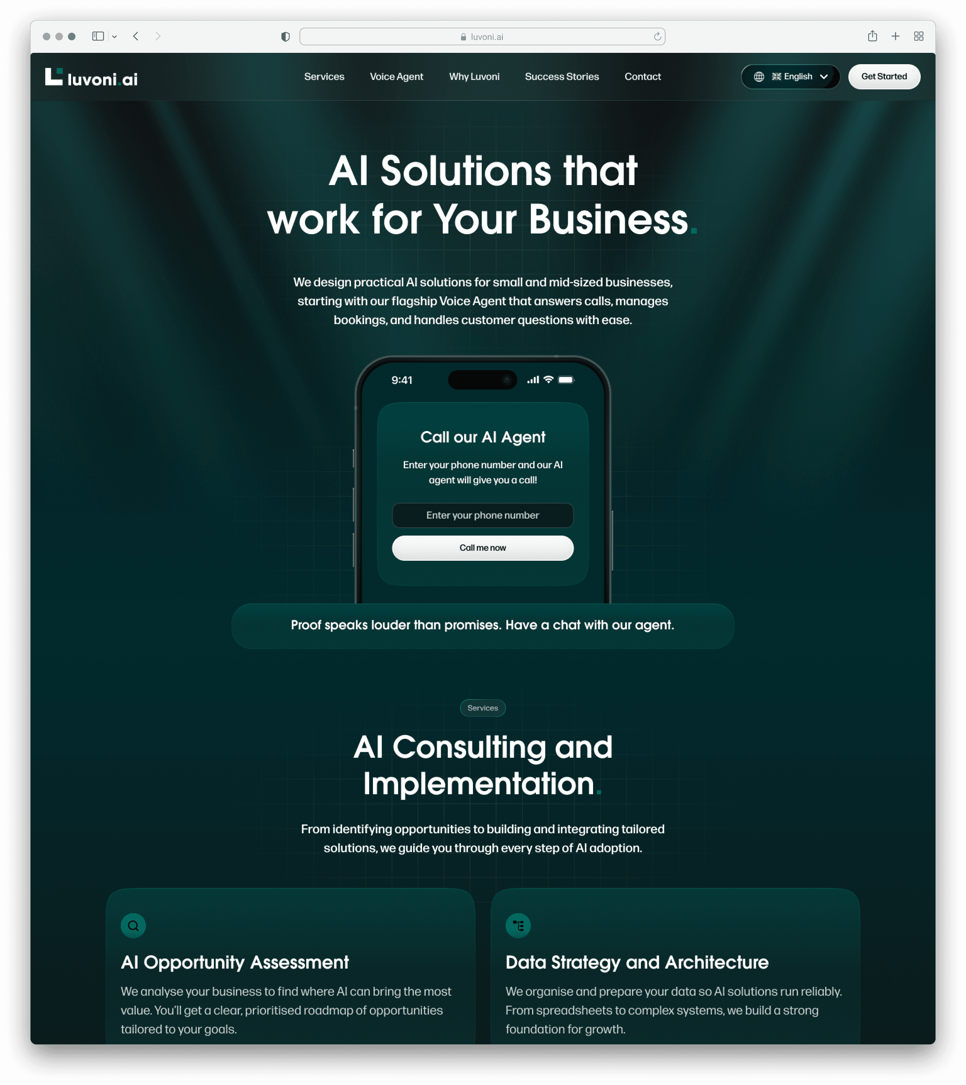
You cannot argue someone into trusting an AI on the phone.
Luvoni's product answers calls for a business. For a massage studio owner who has spent a decade answering that phone personally, handing it over is not a small decision, and no amount of copy about accuracy or availability does the work. The objection is not informational. People think they already know what an AI voice agent sounds like, and what they are picturing is worse than the thing Luvoni built.
So the site was built around the one thing that settles it. A visitor types in their number, and within seconds the receptionist rings them. Everything else on the page exists to get them to that field and make them comfortable enough to use it.
What is Luvoni
Luvoni is an AI consultancy whose launch product is a voice agent that works as a virtual receptionist. It answers calls under the client's own business name, books appointments against a live calendar, handles rescheduling and cancellations, answers the questions every business fields a dozen times a week, and sends an email or SMS every time something changes.
The differentiator the founders care about is not how it sounds. It is coverage. Plenty of voice agents demo well on a single clean booking and fall apart on the messy, doubling-back conversations that make up most real calls. Luvoni's argument is that theirs handles the awkward ones.
The audience sits in three shapes. A solo operator running a salon with at most one other pair of hands. A team of two to ten with no receptionist, where someone is fielding calls between doing their actual job. And larger practices of thirty to fifty with a reception desk already in place. It starts in massage and beauty studios and widens to any business with reception work to do, with more services planned beyond voice.
The starting point
There was a product, a name and three founders. No mark, no typeface, no colour, no site and no way to show the thing off.
We started with a kickoff call and an onboarding questionnaire, because written answers force a founder to be specific in a way a conversation does not. Three answers shaped everything after.
The first was the ranking of the website's goals. Trust came first, ahead of explaining the product and ahead of the demo. The second was who the audience is: small business owners, not technology buyers, who need to understand this in plain words without being made to feel behind. The third was how the brand should land, which they put as two impressions in sequence. Professional first. Then wanting it.
Brand Direction

A logo built from two squares. The mark is a perfectly square L with a gold accent square set against it. Those two components rotate and rearrange to build the full wordmark, so the identity is a modular system rather than a drawing.
That construction is doing an argument, not just a shape. Complex outcomes assembled from simple parts is precisely what Luvoni claims its agents do to everyday reception work. It also scales with the client: to a solo operator the mark reads as professional at first glance, and to a larger institution the system signals something that can grow as their needs get more complicated.
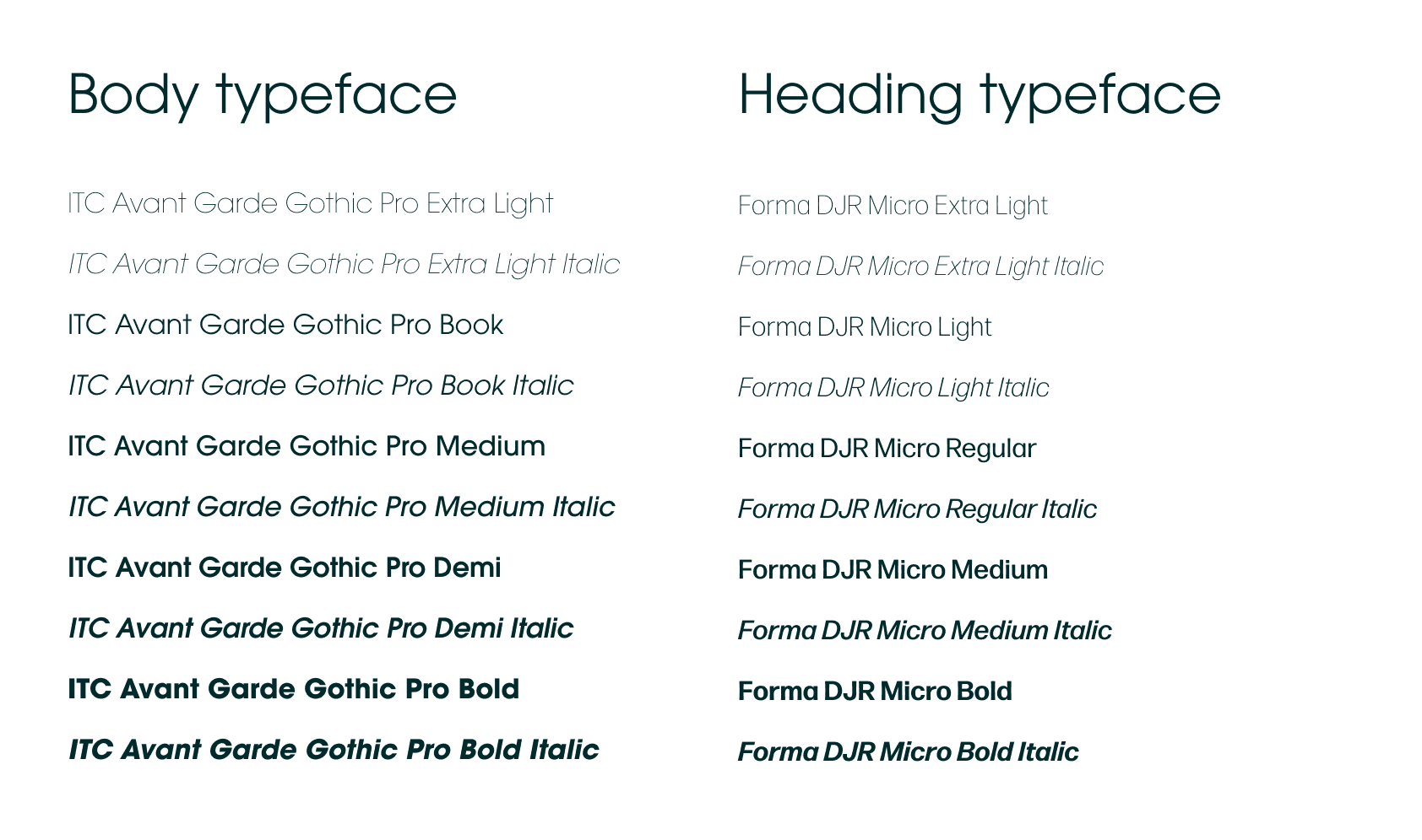
Type that behaves rather than performs. ITC Avant Garde Gothic Pro carries the headings, a geometric sans with a Bauhaus lineage, built from circles and clean lines. Forma DJR Micro does the body, a neogrotesque revival drawn with optical sizes and rounded corners, chosen because it stays comfortable at small sizes across long feature copy and FAQ answers.
The reasoning was mostly about what to avoid. An AI brand that reaches for a futuristic typeface tells a sceptical buyer it is a novelty, and novelty is the last thing you want to project at someone deciding whether to trust you with their phone line. Both faces are confident without being loud, which is the tone the whole brand needed.

Deep teal instead of the category default. AI brands mostly land on the same purple gradient and neon palette, which reads as a technology product to people who buy technology products, and reads as unserious to everyone else. Luvoni's primary is a deep teal, close to black, that feels calm and considered rather than futuristic. A gold accent supplies the spark of something new, coral brings warmth, and the restraint is what makes the whole thing feel like an established company rather than a launch.
Contrast decided up front. The guidelines set out approved colour pairings and explicitly rule out the combinations that fail for colour blindness and low vision, rather than leaving it to be discovered later on a live page. On a brand whose audience skews towards small business owners across a wide age range, legibility is a commercial decision as much as an accessible one.
The Website
The site is built in Framer, designed dark and kept deliberately simple, with small animations rather than motion for its own sake.
The demo is the hero, not a section. The proof sits above the fold, immediately under the headline, as a phone number field and a button that says the AI will call you. It is the highest-commitment thing on the page and it is also the first, because a visitor who takes that call has already had the argument settled for them and everything below is confirmation.
Plain words, in the order someone actually asks. The second goal was understanding without overwhelm, so the page answers questions in sequence rather than listing capability. Three reasons it helps, then three steps to get started, then what it actually does. The feature section is written in terms of what happens on the call, not what the technology is.
Faces on a trust-led page. The founders asked for photos and short introductions of the three of them, which was the right instinct. A young AI company asking a business to hand over its phone line benefits more from three named people with defined roles than from another capability grid.
Built desktop-first and multilingual. Their buyers work from desks rather than phones, so the layout was designed for that case and made responsive around it, and the site was built for English, German and Spanish from the start rather than retrofitted when the first non-UK market arrived.
Results
Full brand identity from a name and a product: modular logo system, two-typeface hierarchy, colour palette and documented contrast rules, delivered as brand guidelines
Framer site designed and built end to end, structured so the product demo is the first thing a visitor meets rather than a section they have to find
The call-back demo placed at the centre of the page, turning the hardest objection in the category into the site's opening move
Built for English, German and Spanish, ready for the markets the founders are heading into
A branding and website brief grown into an ongoing relationship as Luvoni's services expand beyond the voice agent
What Luvoni Thought
"Jack has been incredible to work with. He was patient, creative, and full of amazing ideas. He took the time to truly understand our vision and managed to bring it to life beautifully. We’re extremely happy with how our branding and website turned out and look forward to working with Scale Now Design on all of our future projects!"

Adil Lalani
Co-founder of Luvoni
The partnership continues
The brand and the site are live. The next phase is the one the identity was designed for: more services beyond the voice agent, more industries beyond massage and beauty, and more markets as the German and Spanish sides come into use.
It has become the kind of engagement we aim to build with every client. Trusted enough to own outcomes, not just deliverables.